移动端1px
原创2021/5/18大约 1 分钟
写本篇文章的时候是看了 移动端1px问题解决方案 ,这里面介绍了多种解决方案,我本篇文章只着重介绍 伪元素先放大后缩小 的方法。
可以先点击查看效果链接,建议在Retina屏幕移动端查看:移动端1px,可直接使用手机扫码下方二维码 。
。
效果如下: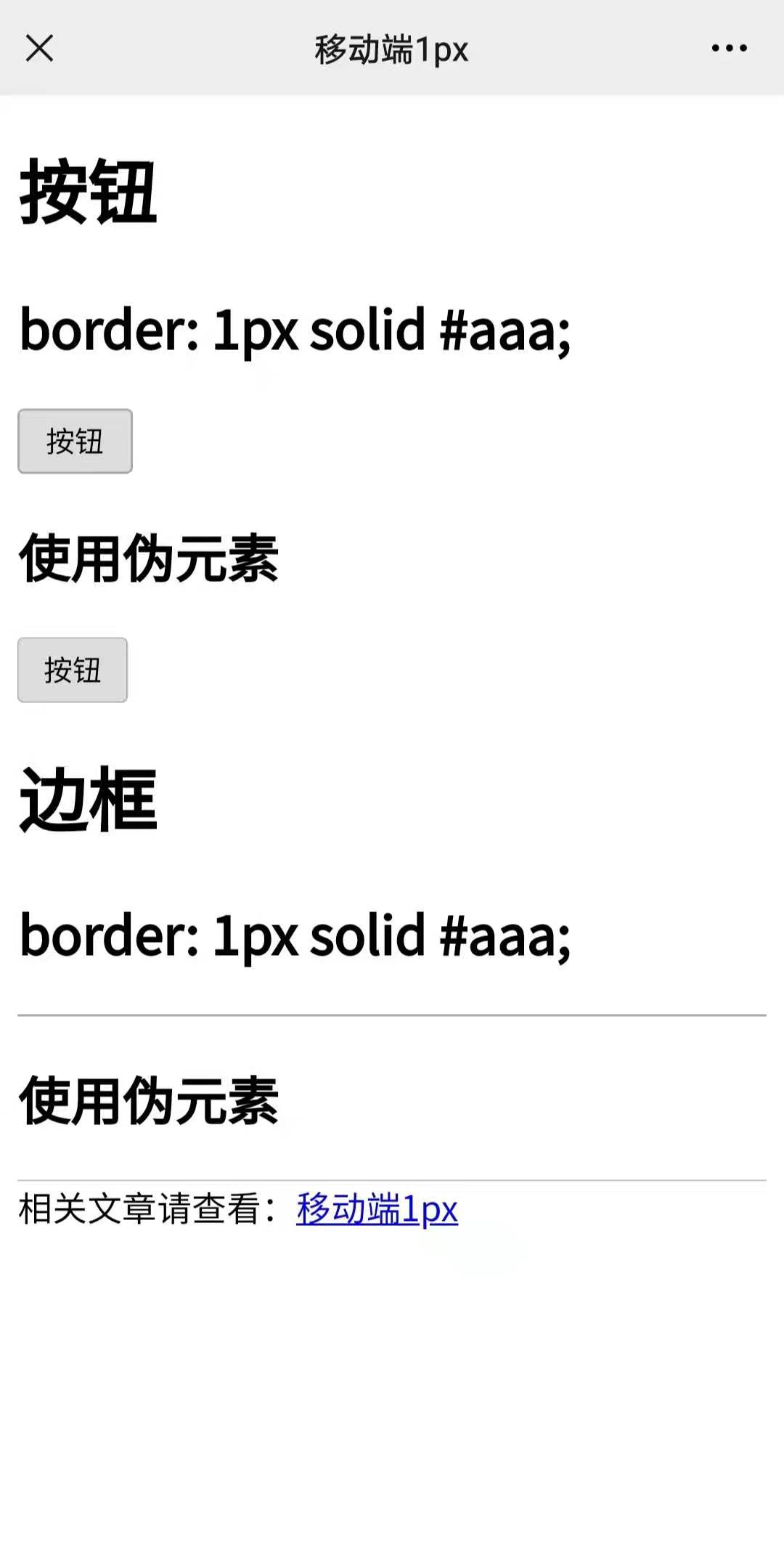
这里只简单介绍两种常用的,其他的举一反三就可以。
按钮边框
Retina屏幕移动端查看上面的例子,可以发现按钮直接设置 border: 1px solid #aaa; 比使用伪元素宽。下面展示代码:
border: 1px solid #aaa;:
<button class="button">按钮</button>
<style>
    .button {
      padding: 0 12px;
      height: 30px;
      cursor: pointer;
      border: 1px solid #aaa;
      border-radius: 3px;
    }
</style>
伪元素:
<button class="button1">按钮</button>
<style>
    .button1 {
      padding: 0 12px;
      height: 30px;
      cursor: pointer;
      position: relative;
      border: 0;
      border-radius: 3px;
    }
    .button1::after {
      content: " ";
      width: 200%;
      height: 200%;
      position: absolute;
      top: 0;
      left: 0;
      border: 1px solid #aaa;
      transform: scale(.5);
      transform-origin: 0 0;
      box-sizing: border-box;
      border-radius: 6px;
    }
</style>
边框
border: 1px solid #aaa;:
<div class="border-bottom-1"></div>
<style>
    .border-bottom-1 {
      border-bottom: 1px solid #aaa;
    }
</style>
伪元素:
<div class="border-bottom-2"></div>
<style>
    .border-bottom-2 {
      position: relative;
    }
    .border-bottom-2::after {
      content: " ";
      width: 200%;
      height: 1px;
      position: absolute;
      top: 0;
      left: 0;
      border-bottom: 1px solid #aaa;
      transform: scale(.5);
      transform-origin: 0 0;
      box-sizing: border-box;
    }
</style>